GALAGA CANNABIS BRAND IDENTITY.
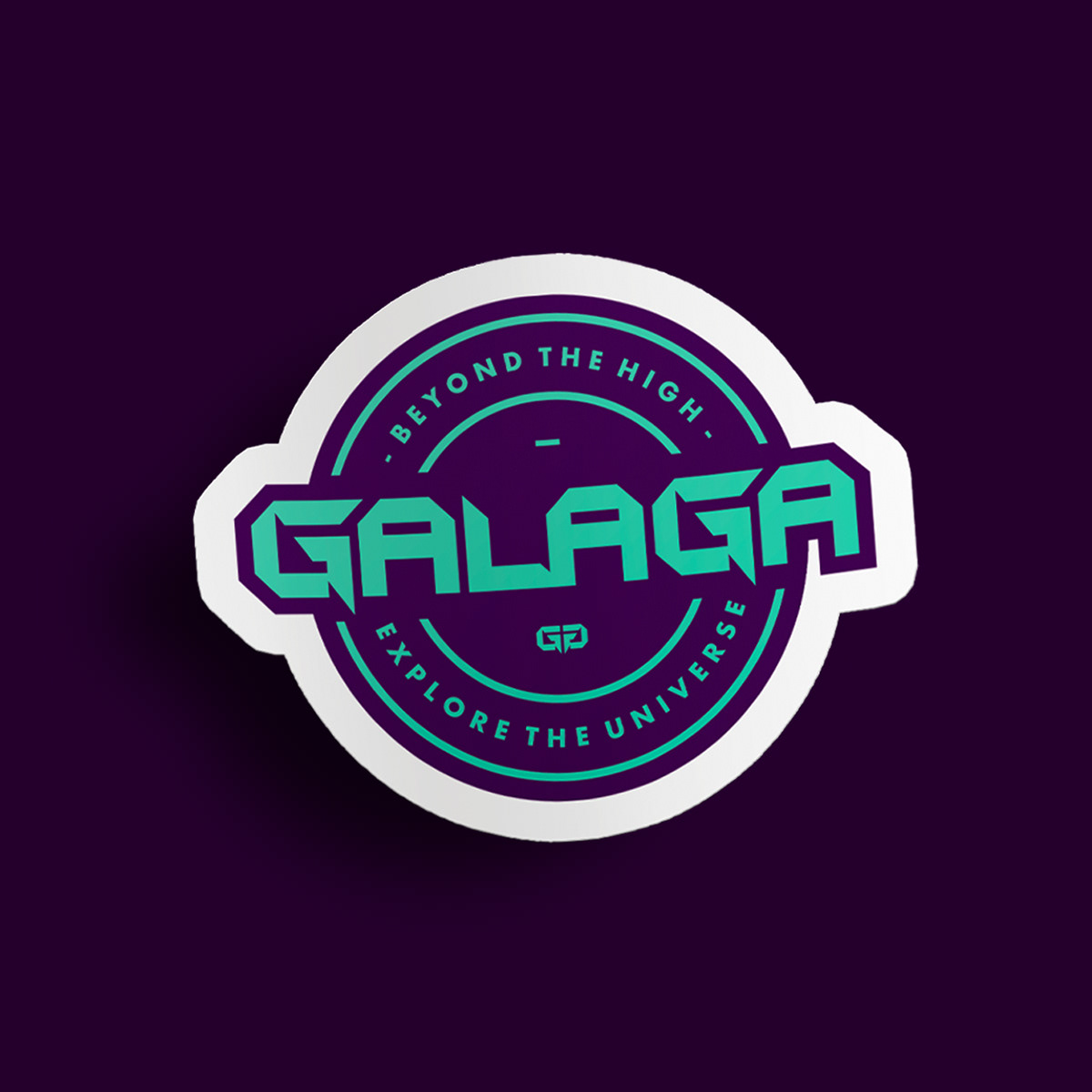
The ‘Galaga Cannabis’ brand identity is a vibrant blend of retro charm and contemporary sophistication. Through the use of Futura as our primary typeface, we’ve embraced a geometric structure that resonates with the iconic aesthetic of the classic arcade game. Avenir, our secondary typeface, adds an air of modernity and elegance, ensuring the brand speaks with a voice that’s both fresh and reliable. Our chosen color palette, with its deep purples and energetic teal, draws inspiration from the game’s own galactic palette, paying homage while propelling the brand into the future of cannabis culture. This is a brand that stands out in the expanding universe of cannabis products, promising quality and an unforgettable experience. In crafting this identity, we’ve aimed to capture the essence of ‘Galaga’—a game that represents both nostalgia and timelessness, and fuse it with the forward-thinking spirit of the cannabis industry. Our mission was to create a look and feel that’s not just seen but felt, reminiscent of the thrill of the game and the promise of new frontiers in the world of cannabis.
The ‘Galaga Cannabis’ brand identity is a vibrant blend of retro charm and contemporary sophistication. Through the use of Futura as our primary typeface, we’ve embraced a geometric structure that resonates with the iconic aesthetic of the classic arcade game. Avenir, our secondary typeface, adds an air of modernity and elegance, ensuring the brand speaks with a voice that’s both fresh and reliable. Our chosen color palette, with its deep purples and energetic teal, draws inspiration from the game’s own galactic palette, paying homage while propelling the brand into the future of cannabis culture. This is a brand that stands out in the expanding universe of cannabis products, promising quality and an unforgettable experience. In crafting this identity, we’ve aimed to capture the essence of ‘Galaga’—a game that represents both nostalgia and timelessness, and fuse it with the forward-thinking spirit of the cannabis industry. Our mission was to create a look and feel that’s not just seen but felt, reminiscent of the thrill of the game and the promise of new frontiers in the world of cannabis.